Color modes in printing projects
Color is one of the most important aspects of any print project. Knowing which color mode to use can make the difference between a vibrant, professional-looking print job and an amateurish, washed out result. For this reason, it’s essential that you understand the differences between CMYK, RGB and Pantone color modes for printing projects so that you can determine which is best suited for your needs. In this article we’ll explore the advantages and drawbacks of each color mode as well as offer some tips on how to select the right one for your project.
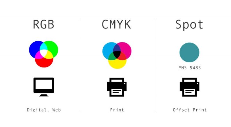
The differences between CMYK, RGB and Pantone color modes
When printing projects, it is important to know which color mode to use. There are three main color modes you can use: CMYK, RGB and Pantone. CMYK stands for Cyan, Magenta, Yellow and Key (Black). It is used in print shops because it uses ink to create the colors. RGB stands for Red, Green and Blue – this color mode is used on computers and other digital devices like phones or tablets. Pantone colors are special pre-mixed inks that give a consistent look across different types of materials like paper or fabric. Each of these color modes has advantages and disadvantages when it comes to printing projects so you should pick the one that best fits your needs.
How to set up RGB and CMYK colour modes in design programs?
– Adobe Photoshop
Setting up RGB and CMYK color modes in Adobe Photoshop is a fairly straightforward process. To begin, open your image in the program and click on the “Image” menu at the top of the screen. From here, select “Mode” and then choose either “RGB Color” or “CMYK Color,” depending on which color mode you need to use. For example, if you’re printing a project that needs to be printed using CMYK ink, you’ll want to select “CMYK Color.”

Once you’ve chosen your desired color mode, you’ll be able to adjust various settings such as brightness, contrast, saturation, hue and more. You can also modify specific colors in your image by clicking on the swatch icon next to the individual color channels. This will allow you to make subtle adjustments for a more precise color palette.
Finally, when working with both RGB and CMYK color modes it’s important to remember that each may require different levels of adjustment for optimal results. For example, when adjusting an image from RGB mode to CMYK mode certain colors may appear darker or lighter than expected due to differences in how each color mode perceives lightness/darkness. To help prevent this issue from occurring it’s best practice when possible to adjust images directly within their respective color modes instead of converting between them.
– Adobe Illustrator
Setting up RGB and CMYK color modes in Adobe Illustrator is a simple process. To get started, open up your project and navigate to the “Color” panel in the upper left corner of the screen. From here you can select either “RGB Color” or “CMYK Color,” depending on which color mode you need to use for your project.

Once your desired color mode is selected, you’ll be able to adjust various settings such as brightness, contrast, saturation and hue. You can also modify specific colors in your image by clicking on the swatch icon next to each individual color channel. This will give you more control over precision when it comes to creating subtle adjustments in your design.
When converting from one color mode to another (e.g., RGB to CMYK) keep in mind that certain colors may appear darker or lighter than expected due to differences in how each color mode perceives lightness/darkness. To prevent this issue from occurring it’s best practice when possible to adjust images directly within their respective color modes instead of converting between them. Additionally, if you’re producing a four-color print job then be sure that all spot colors (if any) are converted into CMYK before sending off the final file for printing.
How to check the colour mode of your document
To check the color mode of your document, you need to open up the image in a design program like Adobe Photoshop or Illustrator. Then look for a menu at the top of the screen and select “Mode.” Here you’ll be able to see if your document is in RGB or CMYK color mode.
Conclusion
In conclusion, selecting the right color mode for your printing project is an important step in ensuring that you get the results you need. By understanding how each of these modes works and what they’re best used for, as well as by setting up RGB and CMYK color modes correctly in design programs such as Adobe Photoshop and Illustrator, you can make sure that your projects are printed just the way you want them to be. Furthermore, don’t forget to check the color mode of your document before sending it off for print so that any potential issues can be caught early on. With a bit of knowledge about color theory and practice under your belt, there’s no reason why all of your prints won’t turn out perfectly!
FAQ
Q: What color mode should I use for printing?
A: The best color mode to use for printing varies depending on the project. For general print projects, RGB is usually better suited for web-based projects, while CMYK is more suitable for print. However, if you have a specific design in mind – such as a logo or business card that needs to be printed – then it’s best to consult with a professional printer and determine which color mode will work best for your needs.
Q: What is the difference between RGB and CMYK?
A: The main difference between RGB and CMYK is that RGB is an additive color model used primarily when working with digital media (such as images displayed onscreen), while CMYK is a subtractive color model used primarily when printing. This means that colors created using the RGB model are brighter and more vibrant than those created using the CMYK model, since the latter requires additional ink to create its colors.
Q: How do I convert between RGB and CMYK modes?
A: Converting between color modes can be done directly within most design programs, such as Photoshop or Illustrator. To do so, open up your project and select “Mode” from the menu at the top of the screen. Here you’ll be able to choose either “RGB Color” or “CMYK Color,” depending on which mode you need to convert from or to. Once your desired color mode has been selected, you can adjust various settings such as brightness, contrast, saturation and hue before saving out your file.
Q: Are there any tips for avoiding unexpected results when converting between RGB and CMYK modes?
A: Yes! When adjusting an image from one color mode to another (e.g., RGB to CMYK) certain colors may appear darker or lighter than expected due to differences in how each color mode perceives lightness/darkness. To help prevent this issue from occurring it’s best practice when possible to adjust images directly within their respective color modes instead of converting between them. Additionally, if you’re producing a four-color print job then be sure that all spot colors (if any) are converted into CMYK before sending off the final file for printing.


0 comments
There are no comments yet. Be the first one to post a comment on this article!
Leave a comment